
April 13th, 2026
Our First Canvas: The Story
Behind the Hi Neighbor Mural
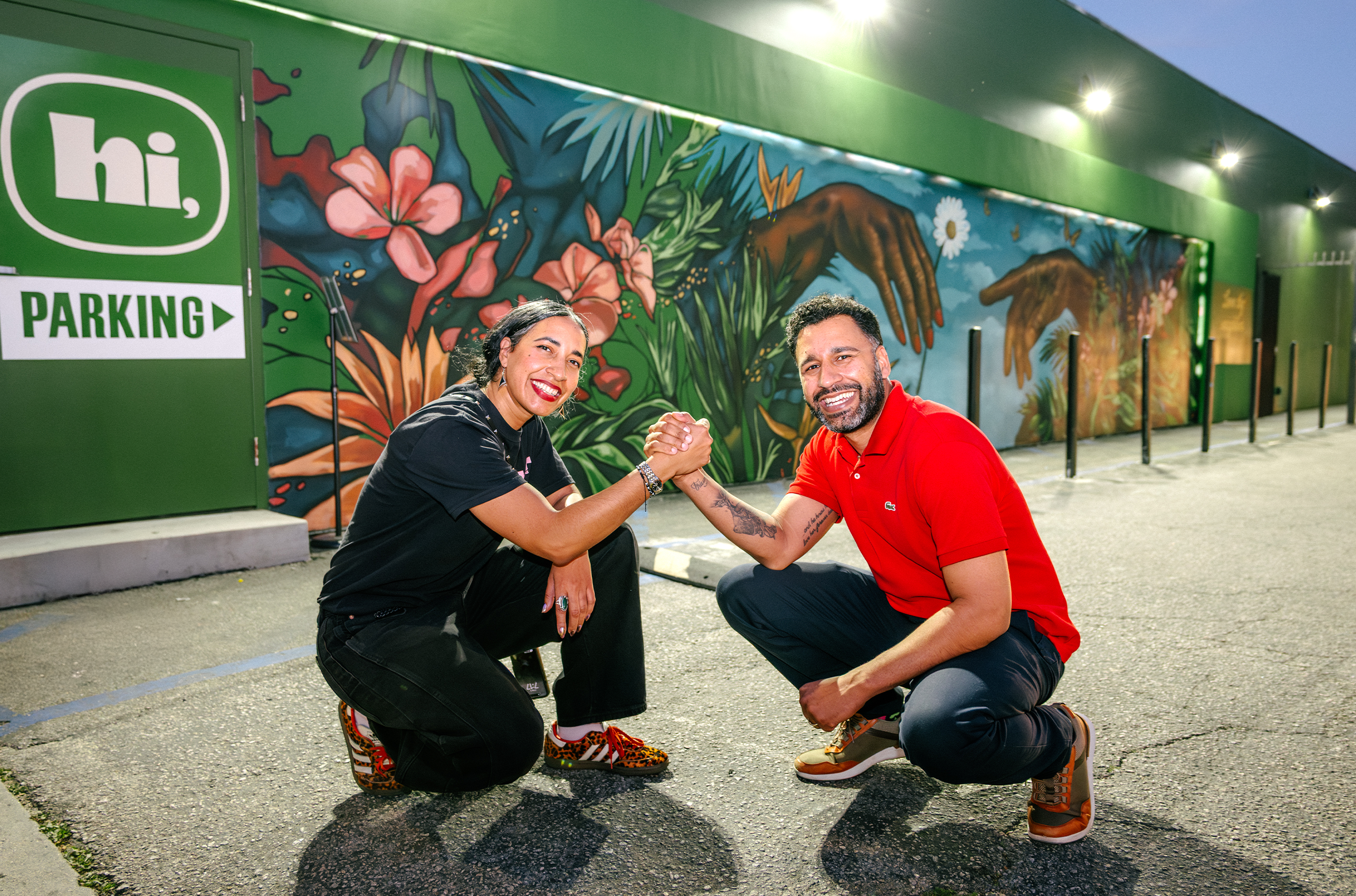
If you drive down Magnolia Boulevard in the NoHo Arts District, you’ll see it before you reach the door.
A long wall of color, plants, and two hands reaching toward each other — a quiet moment painted across the side of our building. Off to the side, almost like a whisper to the street, the words read: Love Thy Neighbor.
For us, that mural is more than decoration. It’s the first story we wanted to tell about Hi Neighbor.
My sister and I are Puerto Rican and were born in the Bronx, where neighborhood life has its own rhythm.
Our grandmother ran a botanica in the South Bronx. We moved away when we were still young, but for many years our summers brought us back to New York, and we spent a lot of that time around her shop.
It was the kind of place where people came not just for products, but for conversation, guidance, and connection.
That idea stayed with us.
Life eventually carried us across the country — through different cities, different careers, and different chapters — before we both landed here in Los Angeles. When the opportunity came to build our own business, we started by thinking about what kind of place we wanted to create.
That’s where the name Hi Neighbor comes from. A small phrase that carries a big idea — that businesses can be open, welcoming, and part of the rhythm of the community around them.
The NoHo Arts District made that vision feel even more meaningful. This is a neighborhood shaped by creativity, by artists, and by people who leave their mark on the spaces around them. It didn’t feel right to move into a place like this and leave a blank wall facing the street.
So, before we got too established, we decided to contribute something to the neighborhood itself.
To bring the mural to life, we worked with Jon Moody, an accomplished contemporary artist known for vibrant portraiture and symbolic work that explores cultural and social themes. Moody’s work often blends bold color with human imagery to spark reflection about connection and shared experience. His artwork has appeared in major cultural spaces — from television productions to installations connected to the White House — but what stood out to us most is how his work invites people to pause and think about the relationships that shape our communities.
From the beginning, we also wanted the mural to belong to the people who make Hi Neighbor what it is every day — our staff. Many of them have been part of this shop and this neighborhood for years. They know our customers by name and have helped shape the spirit of the place long before we arrived. So, the mural became something collaborative. Our team contributed ideas during the creative process, and when it came time, they were out there helping bring the vision to life alongside the artist. It mattered to us that the mural didn’t just represent us as owners, but everyone who helps make Hi Neighbor feel like a neighborhood space.
The image created — two hands reaching toward one another surrounded by growth and color — represents exactly that: connection and possibility.
To me, Juan,
The plants and flowers symbolize growth.
The reaching hands represent people meeting in the middle.
And the open sky between them represent the possibilities that exist in every community.
When we added the words Love Thy Neighbor to the wall, it felt like the simplest and most honest way to express what we believe. It’s not meant as a slogan. It’s a reminder.
This mural is our first canvas.
A way to say hello.
A way to share something beautiful with the street.
A way to honor the creative spirit that makes the NoHo Arts District special.
If you happen to drive down Magnolia Boulevard and notice it, even for a moment, we hope it makes the day feel a little brighter.
And if it brings you inside to say hi, even better.
After all, that’s how neighborhoods begin.


Phone Number
(818)-322-2177
Email Address
contact@HiNeighbornoho.com
Company Address
10842 Magnolia Blvd, North Hollywood, CA 91601
Hours
7am - 10pm
